
Brand Guidelines
The building blocks of the PIXELAR identity — our logo, colour and type. Use them as described here to keep the brand consistent everywhere it appears.

Logo
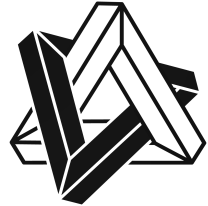
The PIXELAR mark is an interlocking, impossible-geometry form built from isometric beams. It comes in three finishes.


Lockups
The icon can stand alone or pair with the wordmark in the horizontal lockup. Keep the supplied proportions and spacing.
Clear space
Keep clear space around the logo at least equal to the width of one beam of the mark (X). Never let type or other elements intrude.
X XMinimum size
To stay legible, never show the icon below 24 px, or the horizontal lockup below 120 px wide.
24 px 120 pxMisuse
Protect the logo's integrity. Never:
Colour
Our palette is a single dark base carrying a seven-stop pastel spectrum. The spectrum is the signature — use it in the logo and for expressive accents. Use the base for backgrounds.
Typography
PIXELAR uses the Inter family throughout, with JetBrains Mono for code.
Using our brand
For press, partnerships or any question about using the PIXELAR logo, get in touch.
Contact us